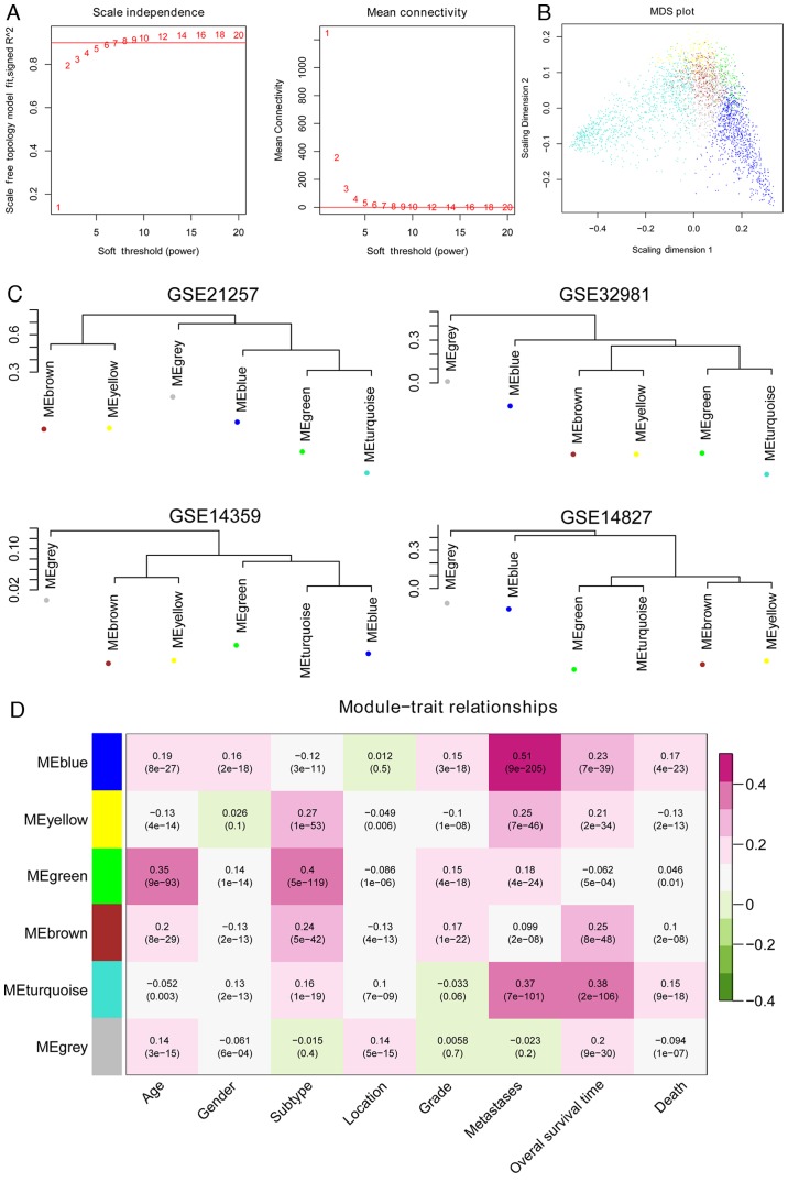
Figure 3.
Assessment of the stability of the modules. (A) Adjacency function definition for the genes. The left chart represents the power selection diagram of adjacency matrix weight parameter. The horizontal axis represents weight parameters of the power, while the vertical axis represents the square values of correlation coefficient between log (k) and log [p (k)]. A higher square value indicates the scale-free distribution of these data. The red line represents the standard line while square value reached 0.9. The right chart represents the mean connectivity of genes under different adjacency matrix weight parameters. (B) Multidimensional scaling plot of genes in each module. The X- and Y-axes represent the first and second principal components, respectively. (C) Cluster dendrogram of modules in the four datasets, GSE21257, GSE32981, GSE14359 and GSE14827. (D) Heat map for the correlation between each module and clinical factors. The horizontal axis represents clinical factors and the vertical axis represents different colored modules; the color changes from green to pink indicate changes from negative to positive, the numbers in the grid indicate the correlation coefficient and the numbers in parentheses indicate the significance of the correlation (P-value).

