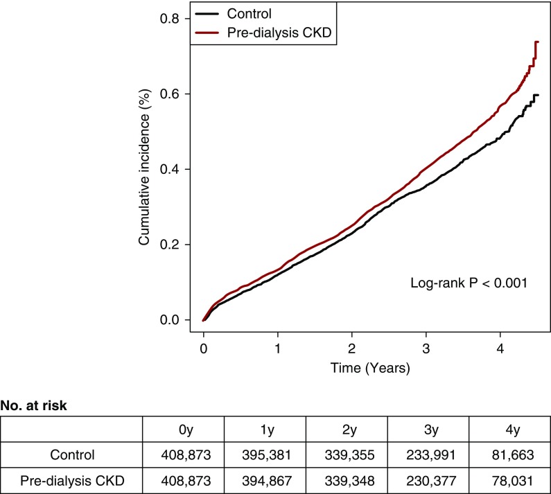
Figure 2.
Higher active tuberculosis cumulative incidence was shown in the predialysis CKD group when compared to the matched control group. The x axis indicates the time (years), and the y axis indicates the cumulative incidence (percentage) of active tuberculosis during follow-up. The red graph indicates the cumulative incidence of the predialysis CKD group, and the black graph indicates the cumulative incidence of the matched control group. The P value calculated from the log rank method is shown. The survival table showing the number at risk is below the survival graph.

