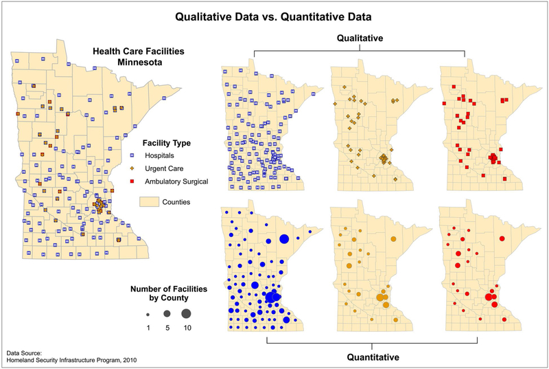
Figure 3.
Qualitative versus quantitative data are displayed. On the right, the top 3 maps (qualitative) depict facilities by type, and the bottom 3 maps (quantitative) depict the number of facilities by county. Source: Centers for Disease Control and Prevention Cartographic Guidelines for Public Health.98

