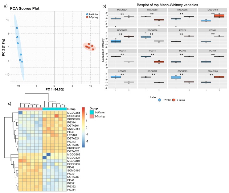
Figure 7.
PCA score plot of two first PCs of lipid data set acquired by LC–MS of the two groups: winter (February) and spring (May) (a) and boxplot of the lipid species, sorted (left to right, top to bottom) using the q value. Mann–Whitney U test results displayed in box plots showing significant differences between seasons, ** q < 0.01. (b). Two-dimensional hierarchical clustering heat map of the polar lipid data (c). Levels of relative abundance are shown on the color scale, with numbers indicating the fold difference from the mean. The clustering of the sample groups is represented by the dendrogram in the top, showing two main clusters: February and May. The clustering of individual lipid species is represented by the dendrogram to the left, showing 2 main clusters. Labels of the species are according to the notation AAAAxxi (AAAA = lipid class; xx = total of carbon atoms in fatty acid; i = number of unsaturations).

