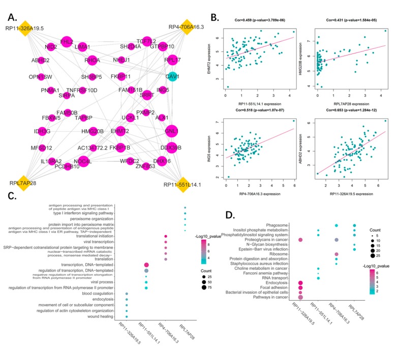
Figure 7.
(A) Network of 4 pseudogenes and their top 10 correlated genes. The correlation between pseudogenes and genes were performed by Pearson correlation analysis. The interaction among genes were generated by STRING database. Yellow dots represent pseudogenes, red dots present positive corelated genes and blue dots represent negative corelated genes. The dot size represents node degree. (B) The representative of corelated genes. The dot plots show the most correlated genes of each pseudogenes. (C) The gene ontology enrichment analysis for the four pseudogenes correlated genes were carried out in DAVID to reveal the potential function of the four pseudogenes. The top five significant biological process terms for each pseudogene were shown. (D) The KEGG pathway enrichment analysis for the four pseudogenes correlated genes were carried out in DAVID to reveal the potential pathways in which the four pseudogenes are involved. The top five significant pathway terms for each pseudogene were shown.

