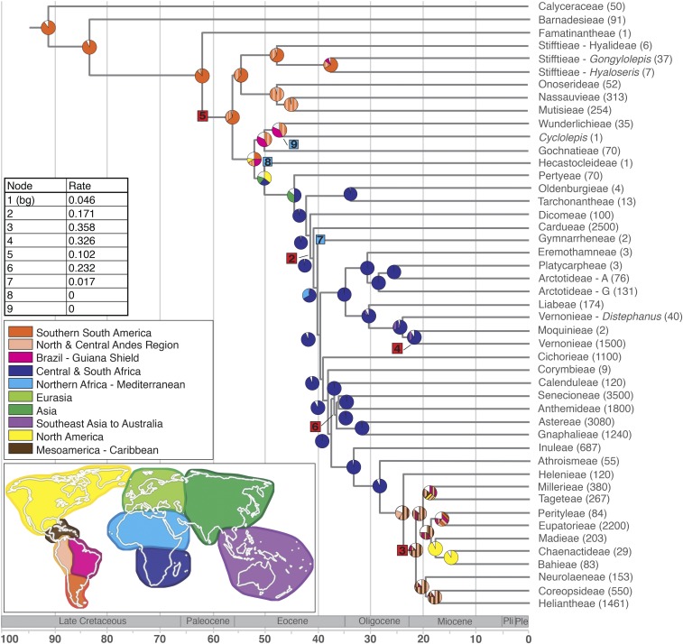
Fig. 3.
Tribe-level chronogram and ancestral range estimates. Probabilities for ancestral ranges are illustrated in pie charts color coded by geographic regions on the world map. Diversification rate shifts are indicated on the phylogeny with numbered boxes corresponding to the table above the geographic legend. Rate shift increases in red and downshifts are blue boxes. Species numbers per tribe are indicated to the Right of tribe names.

