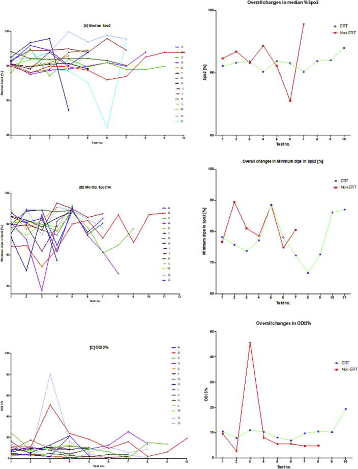
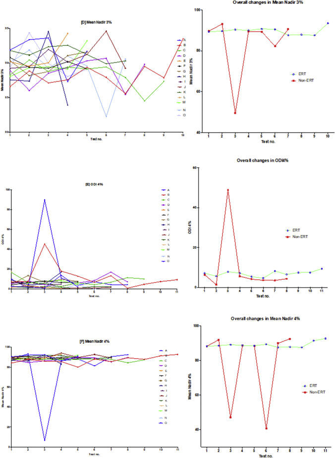
Fig. 3.
Oximetry changes over the course of the study.
The diagram illustrates individual plots and natural progression in oximetry for each subject, along with summary plots, divided into ERT and non-ERT groups. This was conducted for: (A) median %Spo2, (B) ODI3%, (C) mean nadir 3%, (D) ODI4%, (E) mean nadir 4% and (F) min dip SpO2 (%). Note also that the graph on the right of the induvial plots is a summary that describes the mean changes of all subjects in the ERT and non-ERT of the study period.


