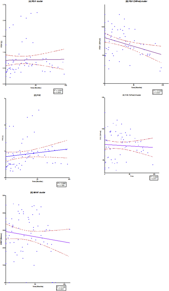
Fig. 4.
Linear regression of spirometry changes over time.
The diagram illustrates individual scatterplots for spirometry changes over time: (A) FEV1, (B) FEV1[%Pred], (C) FVC, (D) FVC [%Pred], (E) FEV1/FVC) and (F) 6MWT. Note the solid purple line is the linear regression line with the red dashed lines providing the 95% confidence lines, where there can be 95% confidence that the population mean would lie between these lines. The widening of the 95% confidence band towards the end of the study demonstrates that there were fewer results towards the end of the study. R2 and p values are shown in each of the regression plots. (For interpretation of the references to colour in this figure legend, the reader is referred to the web version of this article.)

