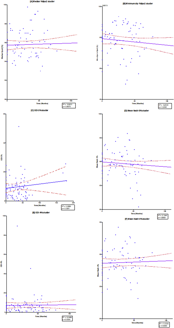
Fig. 5.
Linear regression of oximetry changes over time.
The diagram illustrates individual scatterplots for oximetry changes over time: (A) median %Spo2, (B) ODI3%, (C) mean nadir 3%, (D) ODI4%, (E) mean nadir 4% and (F) min dip SpO2 (%). Note the solid purple line is the linear regression line with the red dashed lines providing the 95% confidence lines. R2 and p values are shown in each of the regression plots. (For interpretation of the references to colour in this figure legend, the reader is referred to the web version of this article.)

