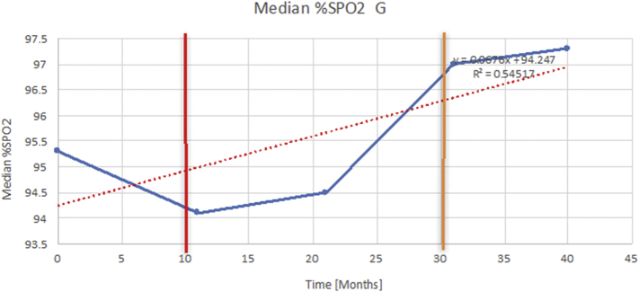
Fig. 6.
The effects of adenotonsillectomy and NIV.
The above graph demonstrates an example of how each of the individual plots where constructed to ascertain the changes in pulmonary function over time. A line of best fit creating a regression line was created to ascertain the overall trend of whether there was a decline or improvement. Note also, the solid red and orange bars, that mark when a therapeutic intervention was undertaken. The solid red line (−) indicates when adenotonsillectomy was undertaken and the orange line (−) illustrates when NIV was instituted. (For interpretation of the references to colour in this figure legend, the reader is referred to the web version of this article.)

