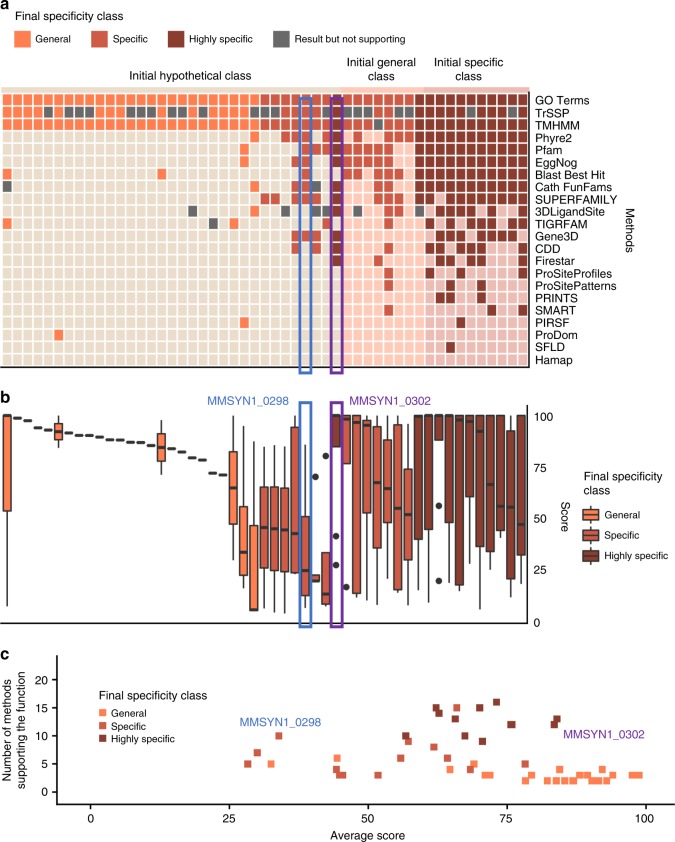
Fig. 5.
Proteins assigned new functions. This figure shows the 51 proteins where the specificity class was increased. Results for each final specificity class are represented by a different colour: orange for the General specificity class, light brown–Specific and dark brown–Highly specific. a Each column represents a protein in the minimal genome and the squares show the methods that made predictions (darker colours indicate support of the final prediction), grey squares indicate predictions that did not support the function, light squares indicate that a method did not make a prediction. Proteins are grouped by their initial specificity class (Hypothetical, General, Specific and Highly specific) and then by their final specificity class. b Boxplot demonstrating the distribution of the scores across proteins. Proteins grouped by their initial specificity class and then by their final specificity class. Horizontal lines represent the median, the lower and upper hinge show respectively first quartile and third quartile, and lower and upper whisker include scores from first quartile to (distance between the first and third quartile) × 1.5 (for lower whisker) and from third quartile to (distance between the first and third quartile) × 1.5 (for upper whisker). Any scores outside of these intervals are shown as points. c The number of methods supporting the function and the average score. Each point represents a protein

