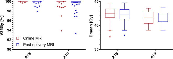
Fig. 3.
Boxplot graph of the GTV coverage (N = 50) described as V35Gy in % and Dmean in Gy for the clinically delivered (ATS) plans and the ATP plans. The bars show the upper and lower quartiles. The whiskers show the minimum and maximum values, excluding outliers (1.5 times the interquartile range) which are denoted with an asterisk. The coverage is evaluated on the daily MRI.

