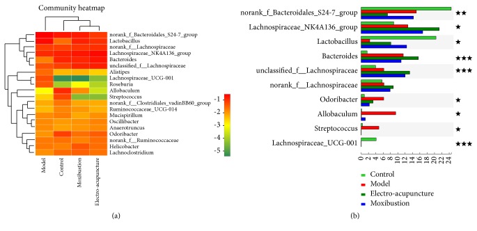
Figure 6.
Heat map and community comparison of intestinal flora. (a) is heat map. The right is the name of communities and the left and upper are the community clustering tree and the sample clustering tree, respectively. The color depth represents different community abundance in heat map. (b) The difference analysis of high abundance communities among groups on genus level. ★ represents the P value of inter-group difference is less than 0.05, ★★represents the P value of inter-group difference is less than 0.01, and ★★★ represents the P value of inter-group difference is less than 0.001. The number of samples is 10 in each group.

