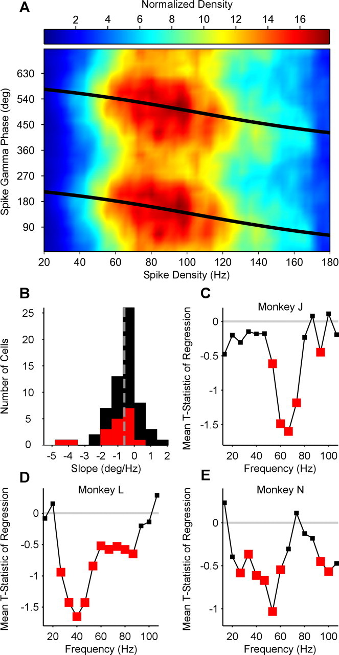
Figure 5.

The relationship between spike density and spike phase. A, Example neuron. Spike phase in the gamma cycle plotted as a function of spike density. Colors represent normalized density. B, Group result. Distribution of linear–circular phase-shift regression parameter across neurons. Red bars indicate significant regression weights. Distribution is clearly skewed to the left. C–E, Comparison of frequencies. Average t statistic of spike phase onto spike density regression plotted as a function of frequency. For each monkey, gamma-phase shifting is most significant in that monkey's individual gamma-frequency band (compare with Fig. 1). Red squares indicate significant mean t statistic values (two-sided t test).
