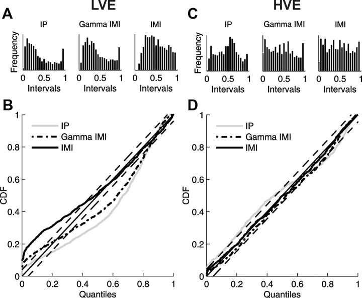
Figure 7.
Comparison of the goodness-of-fit of different models using histograms of rescaled interspike intervals (A, C) and the K–S plots (B, D) for exemplary responses to stimuli of low (A, B) and high (C, D) velocity presented in Figure 6. Histograms and K–S curves were obtained by appropriate rescaling of interspike intervals (see Materials and Methods) with conditional intensity estimated for the IP model (histograms in the left panels, gray lines in K–S plots), the parametric gamma IMI model (histograms in the middle panels, dash–dotted lines in K–S plots), and the nonparametric IMI model (histograms in the right panels, thick solid lines in K–S plots) and then transformed to a uniform distribution on interval [0,1]; vertical axis indicates values of cumulative distribution function (CDF). Diagonals (thin solid lines) correspond to a perfect model of data, and the two parallel thin dashed lines demarcate 95% confidence bounds. The distance of every curve from the diagonal is a measure of the quality of a given model. Notice the poor behavior of all the models for the low velocity example.

