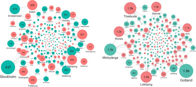
Figure 5.
Transport network of P in excreta from surplus (sea green) to deficit (brick red) municipalities based on P optimization model outputs to minimize total national transport distance and eliminate surpluses of P. The left panel shows the amount (tons) of P from excreta exported or imported from or to a municipality where bubble size is proportional to the amount (also expressed as the number in the bubble). The right panel shows the distance (km) of P from excreta exported or imported from or to a municipality.

