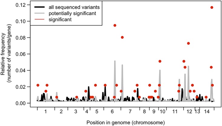
FIG 6.

Comparing variant frequencies across the genome. Data represent relative frequencies of variants per gene for significant genes (red dots) compared to all sequenced variants across all genomes (black line) and all variants that were variable within ST93 genomes (gray line). The only genes shown here are those with at least one potential significant variant; hence, the gray and black lines do not reach 0.
