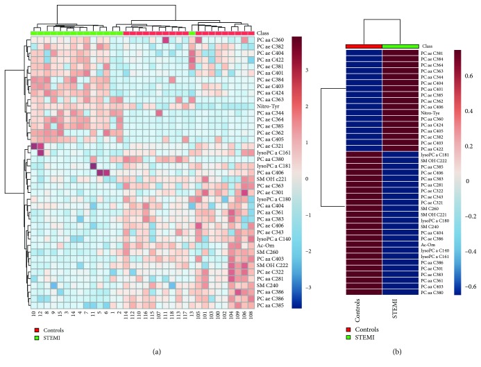
Figure 4.
Heatmap of the metabolomics dataset. The colors represent the mean concentration of metabolites. In (a), individual samples (horizontal axis) and metabolites (vertical axis) are represented; they are separated using hierarchical clustering (Ward's algorithm), with the dendrogram being scaled to represent the distance between branches (distance measure: Euclidean). In (b), the contrast in metabolite concentrations between the patient's group with STEMI and healthy individuals is presented.

