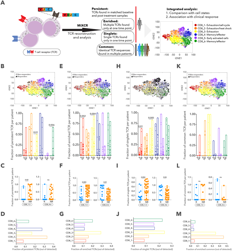
Figure 7. TCR analysis and its relationship with cell state and clinical outcome.
A. Schematic illustration of the TCR analysis pipeline. B, E, H, K. tSNE plot delineating 6 CD8+ T cell clusters and persistent (B), enriched (E), singlet (H) and common (K) TCRs. Bar plot summarizes fraction of TCRs per patient across the different clusters between responder (R) and non-responder (NR) lesions. C, F, I, L. Fraction of persistent (C), enriched (F), singlet (I) and common (L) TCRs per patient, aggregated for CD8_1,2,3 and CD8_4,5,6 clusters for R and NR lesions. D, G, J, M. Fraction of persistent (D), enriched (G), singlet (J) and common (M) TCRs in each cluster, out of total persistent, enriched, singlet and common TCRs. Data are represented as mean±SEM.

