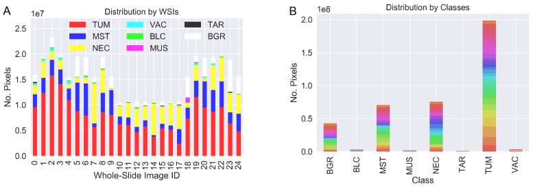
Figure 5.
Two visualizations of the dataset distribution focused on the contribution from each WSI (A) and the class distribution (B). Colors in (B) represent the WSI origin. While we obtain a good balance of the labeled data per slide (A), the class-distribution (B) leads to a very imbalanced machine-learning task.

