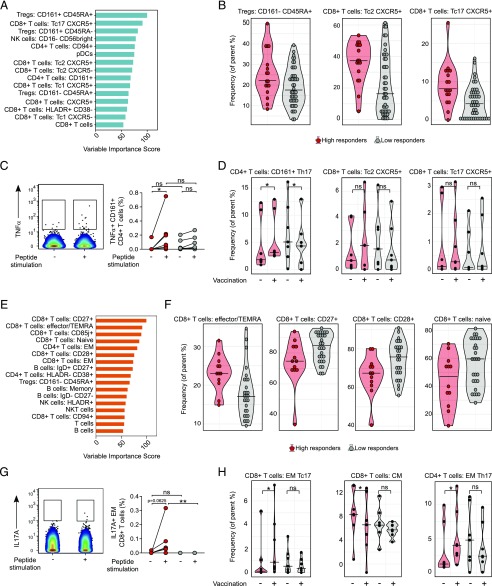
FIGURE 4.
SIMON identifies cellular signature associated with the successful generation of influenza immunity after vaccination. (A) Features with variable importance score above 50 from the model built on dataset 13 are shown. (B) Raw data confirmed by SAM analysis to be significantly changed in the donors from dataset 13 (n = 61 from which high responders = 17 and low responders = 44), indicating frequency of cells (as a percentage of the parent population). (C) Representative plot showing TNF-α intracellular staining of CD161+ CD4+ T cells in the unstimulated (−) or influenza peptide pool (+)–stimulated PBMC from high responder obtained before vaccination. Graph on the right shows the frequency of TNF-α+ CD161+ CD4+ T cells from high responders (red circles, n = 7) and low responders (gray circles, n = 7) in the samples before vaccination. Individual donors are connected with lines. (D) Violin plots show distribution of frequency of CD161+ CD4+ T cells and CXCR5+ CD8+ T with Tc2 and Tc17 phenotype in the PBMC samples derived from high (red, n = 7) and low responders (gray, n = 7) analyzed before vaccination (−) and on day 28 after vaccination (+). (E) Variable importance score of features selected in the model built on dataset 36 with score above 50. (F) Significant immune cell subsets selected by SAM analysis shown as raw data corresponding to donors from dataset 36 (n = 40 from which high responders = 12 and low responders = 28), indicating frequency of cells (as percentage of parent population). (G) Representative plot showing IL-17A intracellular staining of EM CD8+ T cells in the unstimulated (−) or influenza peptide pool–stimulated (+) PBMC from high responders, obtained after vaccination. The graph on the right shows the frequency of IL-17A+ EM CD8+ T cells from high (red circles, n = 7) and low (gray circles, n = 7) responders in the samples after vaccination. (H) Violin plots show distribution of frequency of CD4+ and CD8+ T cells, with indicated phenotypes analyzed in the PBMC samples derived from high (red, n = 7) and low responders (gray, n = 7) before (−) and on day 28 after (+) vaccination. Graphs shown in (C), (D), (G), and (H) represent combined data from seven independent experiments. Violin plots show distribution of individuals. These are represented by red circles for high responders and gray circles for low responders. The line indicates the median. Statistical analysis between high and low responders was performed with one-way ANOVA Kruskal–Wallis test followed by Dunn multiple comparison test. Analysis within groups before and after vaccination was calculated using two-tailed Wilcoxon matched-pairs signed rank test. Significance in SAM analysis was considered at FDR <0.01. *p < 0.05, **p < 0.01. ns, nonsignificant.

