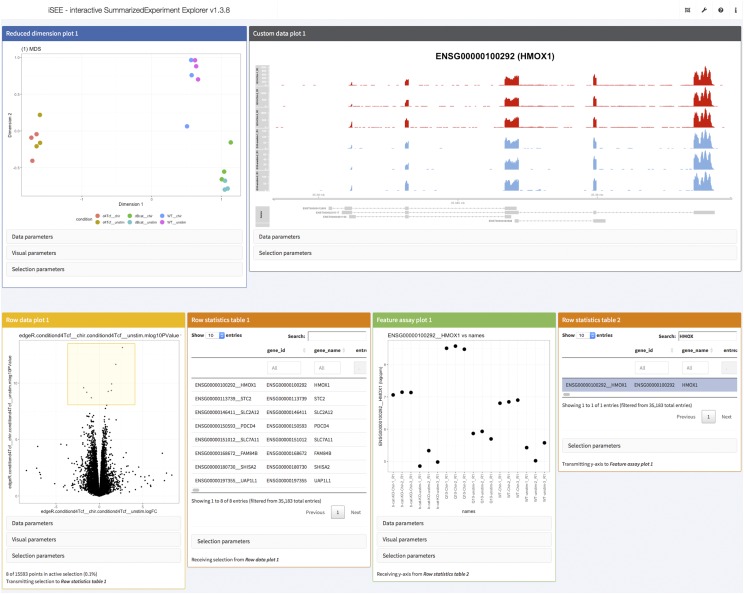
Figure 5.
Screenshot of visualization of data and results from the real data walk-through using the iSEE R/Bioconductor package. The interactive application was configured to display an MDS plot colored by the sample condition (top left), a custom panel showing the observed read coverage of a selected gene (top right), a volcano plot for a specified contrast (bottom left, the selected genes are shown in the adjacent table) and an overview of the log-CPM expression values for each sample, for a gene selected in a second table (bottom right).

