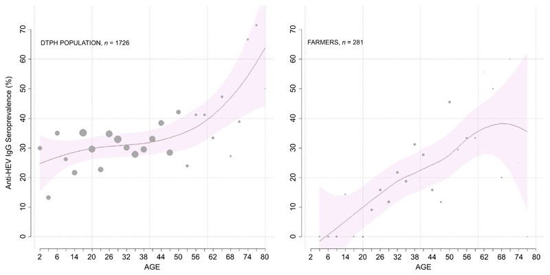
Figure 3.
Seroprevalence in both general population and framers cohort groups analysed in this study. The graphs represent the total seroprevalence observed in the general population (left panel) and in the farmer cohort (right panel) stratified by age. Y-axis shows the seroprevalence percentage of people anti-HEV IgG positive, while the X-axis indicates the age groups; individuals were grouped into 3-year-age bands for maximum informativeness and clarity. The red line shows the inferred seroprevalence curve, and the pink shaded area shows the 95% confidence band. The grey dots show the seroprevalence for each 3-year-age group, and the size of the dot is proportional to the sample size. [Colour figure can be viewed at wileyonlinelibrary.com]

