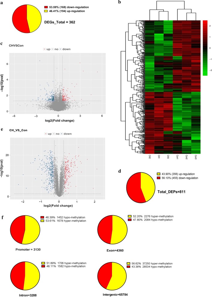
Fig. 2.
Different characteristics between the hypoxic group and the control group. a The pie chart shows the DEGs. b Gene expression heatmap of hypoxia versus control groups: unsupervised hierarchical clustering analysis of the significantly dysregulated genes. Red: upregulated genes; green: downregulated genes. c Volcano plots for the transcriptome comparisons between the hypoxic group and the control group (Fold change > 1.5 and p < 0.05). d The pie chart shows the DEPs. e Volcano plots for the proteome comparisons between the hypoxic group and the control group (Fold change > 1.25 and p < 0.05). f The pie chart shows the DMRs, including promoter, exon, intron, and intergenic regions. The pie chart shows the number and proportion of upregulated and downregulated

