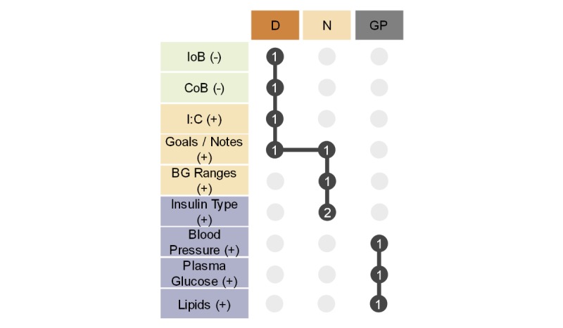
Figure 12.

Matrix presenting the correlation between the suggested adjustments and clinical roles (general practitioner, diabetes nurse, and dietitian). The columns represent the clinical roles and use the same color coding as the previous figures (D/orange: dietitian; N/beige: diabetes nurse; GP/grey: general practitioner). The rows represent the adjustments proposed by the clinicians and follow the same categorization and color coding as the previous figure (light green: remove functionality; beige: new service; lilac: new data type). (-) denotes a proposed functionality removal, while (+) denotes a proposed functionality introduction. The dark grey circles represent a suggested adjustment by a specific clinical role and the number of times it was mentioned by that role. The vertical lines represent logical sets, while the horizontal lines denote the intersections of the logical sets, like a Euler diagram. BG: blood glucose; IoB: insulin on board; CoB: carbohydrates on board; I:C: insulin-to-carbohydrate ratio.
