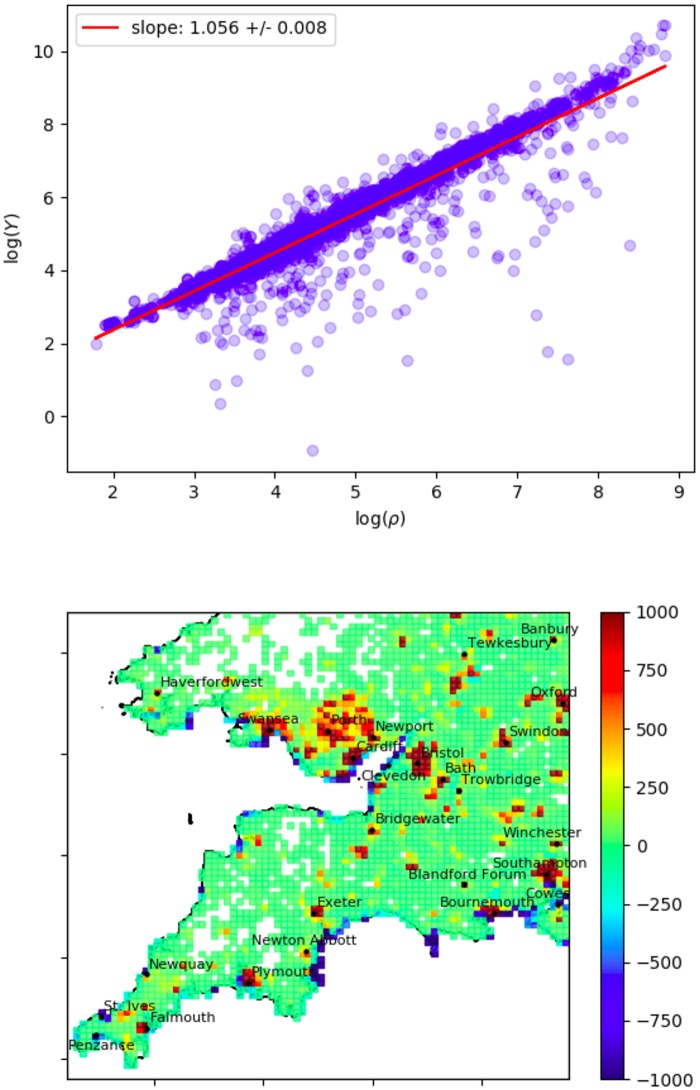
Fig 10. Population anomaly.
Top: Population density ρ versus youth-population density Y on a log-log axis. Bottom: AρY plotted as a heatmap over the South-West UK (with |AρY| capped at 1000 for better resolution). This anomaly measures the excess or deficit of the youth population after accounting for the non-linear scaling above. Here we show the same grid boxes (80 × 80) as Fig 8.

