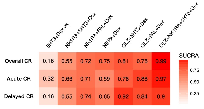
Figure 4.
Heat map graph of efficacy, as assessed by the SUCRA. A heat map graph is a graphical representation of data using color to show the level of comparative strength of each treatment arm. Red represents a higher SUCRA value, which indicates a greater probability of being the best treatment arm, and white represents a lower SUCRA value, which indicates a lower probability of being the best treatment arm. The SUCRA values are described in each box. All statistical tests are two‐sided.
Abbreviations: 5HT3, serotonin receptor antagonist; CR, complete response; Dex, dexamethasone; NEPA, oral combination of netupitant and palonosetron; NK1RA, Nk‐1 receptor antagonist; OLZ, olanzapine; PAL, palonosetron; SUCRA, surface under the cumulative ranking.

