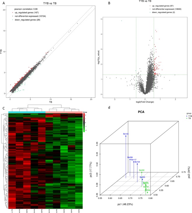
Figure 1.
Plots of mRNA. Scatter plot (A), the x-axis and y-axis represent the mean FPKM values (log2 transformation) of each group of sample genes. The two oblique lines divide the upper and lower genes (1.5 fold difference) and the unmodified genes. Volcano-Plot (B), the x-axis represents the log2Fold_Change value and the y-axis represents -log10p_value. The vertical two green lines are up (right) and down (left), and the green parallel lines correspond to p-value. Hierarchical clustering (C) was performed using FPKM values of significant expression genes obtained by comparison between groups, each row representing one gene and each column representing one sample. The red dots represent up-regulated DEgenes, the green dots represent down-regulated DEgenes, and the gray dots represent indistinguishable genes. PCA analysis (D), each color represents each grouping, and each axis represents a principal component.

