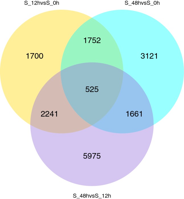
Fig. 2.

Venn diagram showing DEGs from the comparison of three time points. Yellow, blue and purple represent the DEGs of S_12 h versus S_0 h, S_48 h versus S_0 h and the S_48 h versus S_12 h, respectively. The overlapping values correspond to the number of DEGs in two/three comparisons (color figure online)
