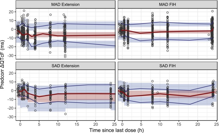
Figure 1.

Visual predictive check of the linear mixed‐effect model. Solid lines are the 10th and 90th (blue) and 50th (red) percentiles of the observed data, and the shaded areas are the 95% confidence intervals around the corresponding percentiles of the predictions. Observed and simulated ∆QTcF data were prediction corrected (predcorr) before plotting. FIH, first in human; h, hour; MAD, multiple‐ascending dose; SAD, single‐ascending dose.
