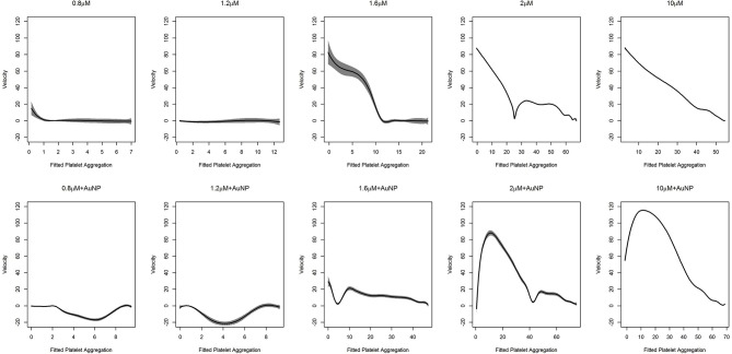
Figure 6.
Fitted curve for nanoparticle experiment. Result of the fit obtained from (9) has plotted here. The predicted velocity is plotted at fitted values of the platelet aggregation. The solid line represents the fit while the shaded portion is the computed 95% confidence interval. The first row of plots represents the fits for different levels of ADP only. The second row represents the fits for ADP with the fixed concentration of nanoparticles (AuNP 40 nm). To facilitate comparison, all the plots have the same vertical axis limits.

