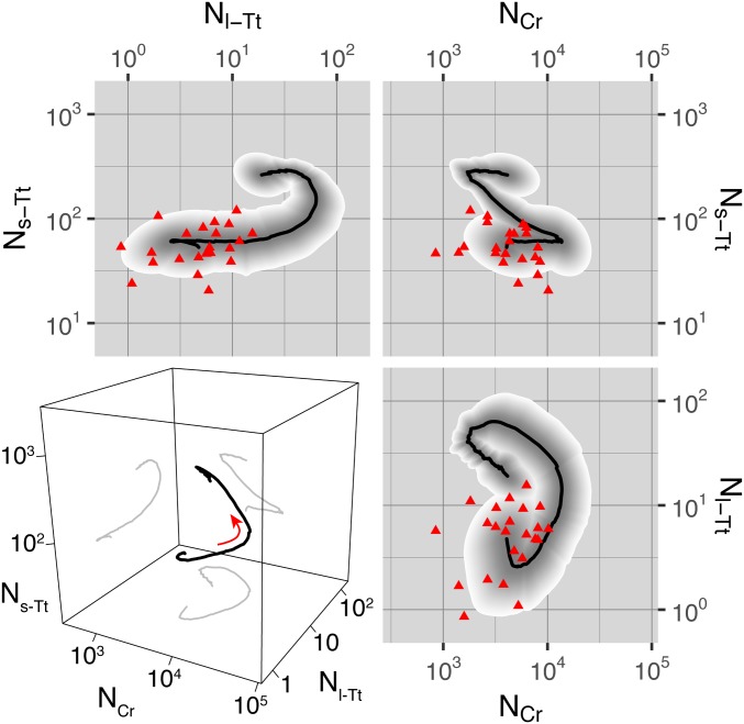
Fig. 4.
Statistics of phase-space trajectories. In the 2D panels, population dynamics are plotted as trajectories in the space of one class’s normalized abundance vs. another’s. Black curve, geometric mean over replicates; shaded region, 68% quantile over replicates, with quantiles colored as a gradient from gray to white to show structure; red triangles, initial abundance for each replicate. The 3D panel at Lower Left shows the mean trajectory as a black curve in the space of normalized abundance of each class, with projections to each 2D subspace shown as gray curves. The red arrow indicates the direction along which the dynamics proceed with time. The classes are denoted as in the text: small T. thermophila, “s-Tt”; large T. thermophila, “l-Tt”; C. reinhardtii, “Cr.”

