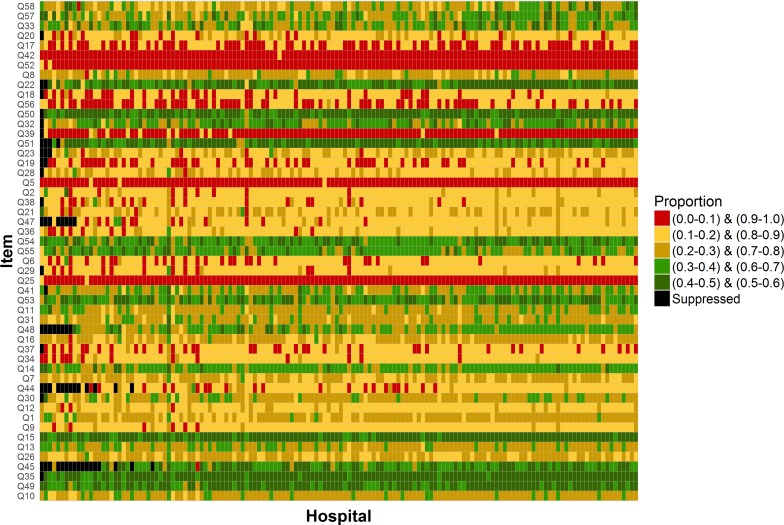
Figure 2.
Proportions of patients reporting a positive experience by question and for each of the 146 hospitals included in the analysis (Cancer Patient Experience Survey 2016). Each rectangle corresponds to a single hospital and question. Its colour indicates one of five proportions categories as shown on the legend. The exact values for each cell in this plot are provided in the online supplementary material table 2.

