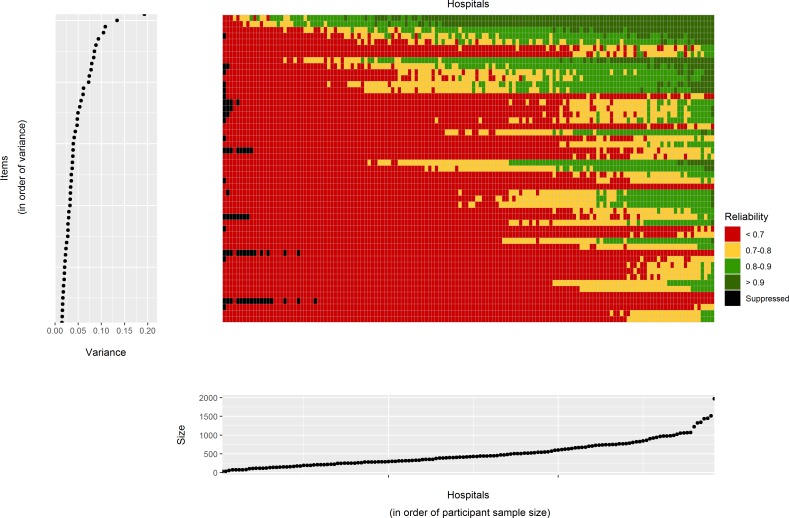
Figure 3.
Main central grid: reliability of hospital scores for each of the 146 hospitals included in the analysis (Cancer Patient Experience Survey 2016). Each rectangle corresponds to a single hospital and question. Its colour indicates one of four reliability categories as shown on the legend. Left hand side plot: the variance for each question on the log odds scale. The order of the questions has the same order than that of the main grid and is sorted from the question with lowest between-hospital variance to the question with greatest between-hospital variance. Bottom plot: the sample size for each hospital in terms of the total number of responders. The order of the hospitals has the same order than that of the main grid and is sorted from the hospital with the smallest sample size to the hospital with greatest sample size. The exact values for each cell in this plot are provided in the online supplementary material table 3.

