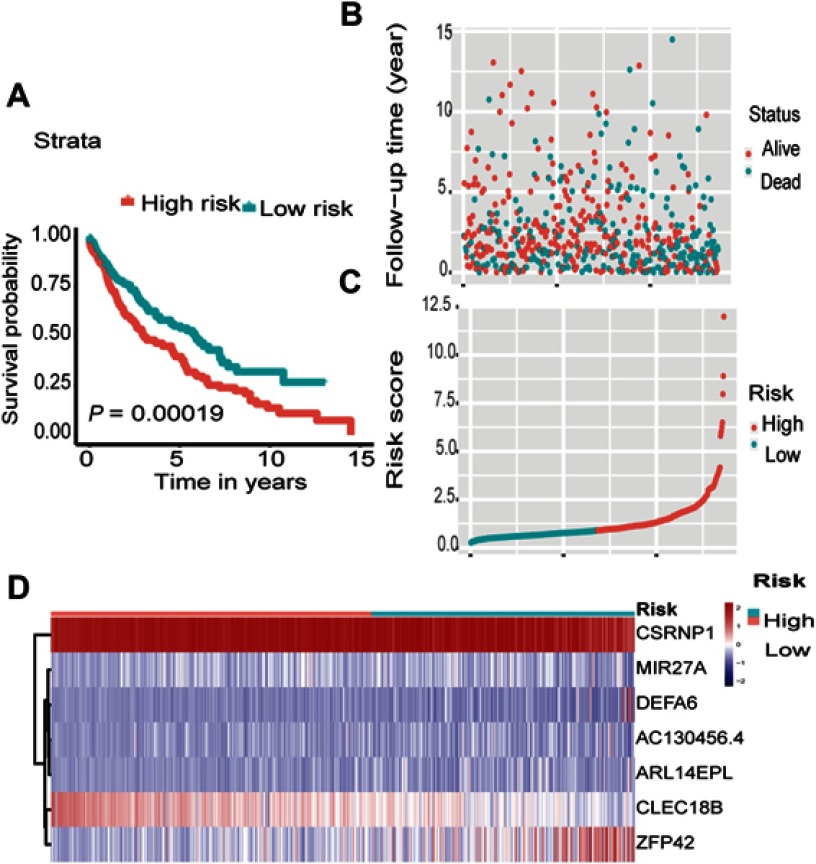
Figure 3.
Outcomes of seven-gene model in the all samples. (A) Kaplan-Meier survival curve illustrates the differences between the high-risk group and low-risk group about survival rate in all samples. (B) The distribution of follow-up time in the all samples. (C) The distributions of the risk scores in the all samples. (D) The distributions of the seven-gene expression profiles of patients in the all samples.

