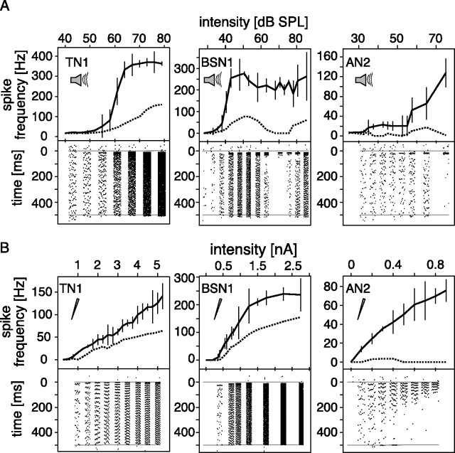
Figure 1.
Input response curves for acoustic and current stimulation. Responses to constant stimuli at different intensities for three different cell types. The thick line in the upper part of each graph describes the onset response curve, measured as the maximum firing rate during the first 30 ms of a 500 ms rectangular stimulus. The dashed line represents the mean response to a 30 ms interval starting 420 ms after stimulus onset. Mean values and SDs for 10 repetitions are shown. The lower parts of the graphs show exemplary spike raster plots for the same stimuli at the intensity indicated by the respective axis, time running from top to bottom. Gray lines indicate the onset and end of the stimulus. A, Acoustic stimulation. B, Current stimulation (cells identical to those in A).

