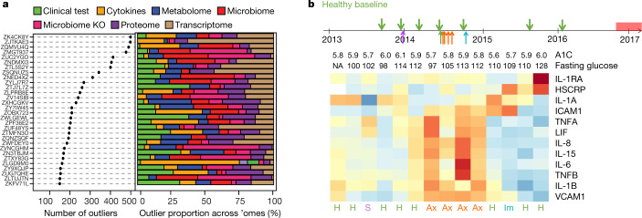
Fig. 6. Personal features that precede the onset of T2D revealed by longitudinal tracking.
a, Left, scatter plot showing the number of outliers among thousands of molecules for each participant; right, the percentage of outliers contributed by each ome. b, Top, collection timeline for participant ZNED4XZ in our study relative to onset of T2D, with green arrows pointing to eight healthy baselines (H), purple for one stress visit (S), red for four antibiotics visits (Ax) and blue for one immunization visit (Im). Bottom, heatmap showing levels of selected immune cytokines together with A1C (%) and fasting glucose (mg dl−1) across time. Red denotes increased expression; blue represents decreased expression, with shades corresponding to levels.

