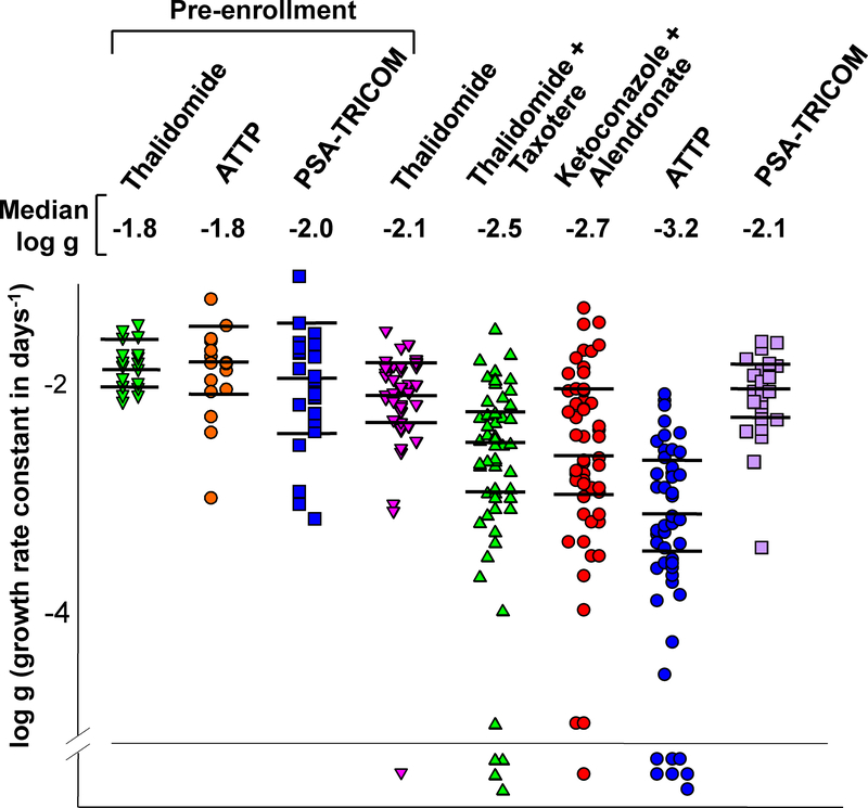
Figure 3:
Dot plots of the distribution of the best-fit growth rate constants in studies conducted over time. The horizontal lines in each set are the median values and the 95% confidence intervals. The Y-axis is the logarithm of the derived growth rate constant. The regression rate constants for patients prior to enrollment on a study are also shown for the thalidomide, ATTP, and PSA-TRICOM trials. Median g values for each study are listed above the dot plots. Symbols below the horizontal line represent patients who achieved a complete response (CR).

