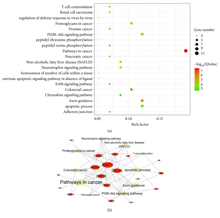
Figure 2.
(a) The size of the bubbles represents the number of target genes, and the color of bubbles indicates the degree of correlation. When the color is closer to red, the correlation is higher. (b) The red node represents the target genes of miR-224-5p, the gray node represents the pathway of those target genes, and the node size represents connectivity. The larger the target gene node is, the more functions it covers. The larger the pathway node is, the more target genes it covers.

