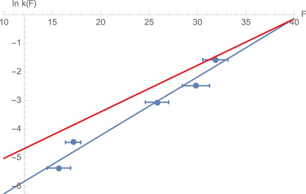
Figure 3.

Estimated unfolding rate constants at different forces. The graph plots the unfolding rates estimated from Eq. 2 (blue circles) at the different unfolding forces. The lines show fits of the data to different models relating the unfolding rate of a protein to the applied force as described in Eq. 3 (blue line, parameters of Model A). Red line shows a different fit of k(F) using the same functional dependence (Eq. 3) but based on the position of the peaks of the distributions (Model B – see text for details.)
