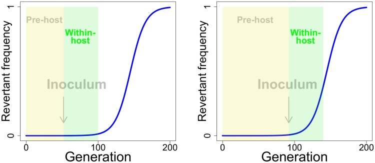
Fig 1. Impact of pre-host evolution on within-host evolution.
The blue curve depicts the time course of revertant frequency in competition with vaccine, where the revertant has a 10% fitness advantage and starts at a frequency of 10−6. The curve shows the well-known population genetic principle that, while the favored type (revertant) is rare, its absolute frequency changes very little. But the frequency eventually reaches a level at which evolution is rapid. The yellow box represents a possible period of pre-host evolution, the green box representing the period of within-host evolution. The periods of within-host evolution are drawn to be the same length in right and left panels, as if the vaccine has the same within-host duration in both cases. The arrow represents a possible point at which manufacture would end and an inoculum be created, thus defining the boundary between pre-host and within-host evolution. The left panel depicts a short period of vaccine manufacture, the right a longer period of vaccine manufacture and one in which more pre-host evolution has occurred. It is thus easy to see the potential importance of pre-host vaccine evolution on within-host evolution, for even when the revertant is not a large component of the inoculum, it can be poised for rapid evolution within the host (right panel). The curve obeys , in which pt represents the revertant frequency in generation t and w the fitness of revertant relative to vaccine. The curve is drawn for a common evolutionary process across pre-host and within-host evolution, but evolution in the within-host phase will typically experience different parameters than evolution in the pre-host phase.

