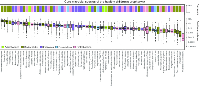
Figure 3:
Core microbial species in healthy OP microbiota. Upper bar plot represents the prevalence of each core species; lower box plot shows the relative abundance of each core species. Different colours refer to different phyla. Boxes represent the interquartile ranges (IQRs) between the first and third quartiles, and the line inside the box represents the median value. Whiskers represent the lowest or highest values within values 1.5 times the IQR from the first or third quartiles. Dots represent outliers.

