
Figure 9.
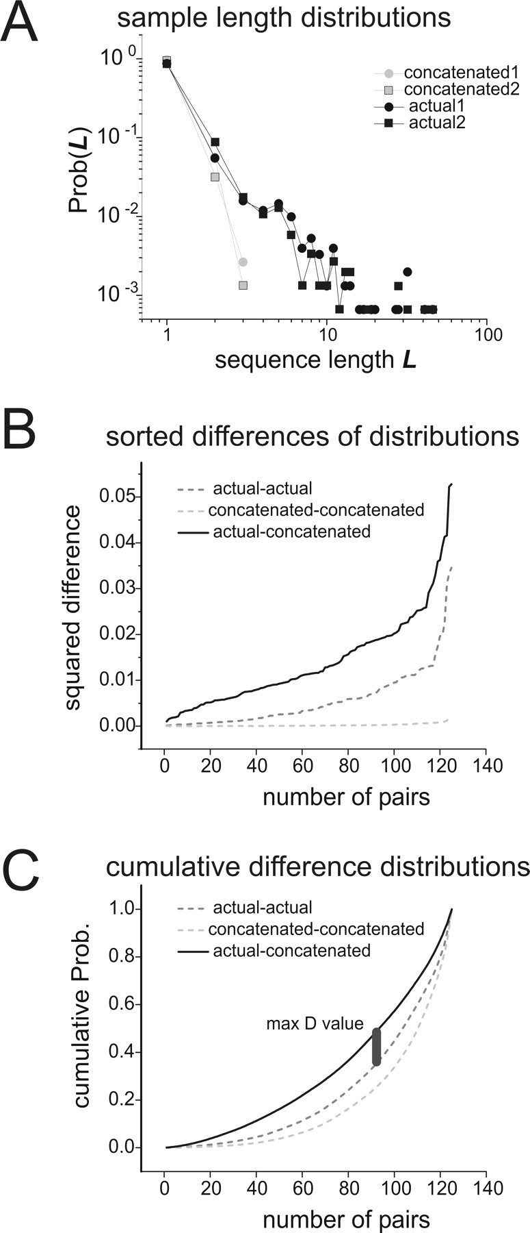
Comparing sequence length distributions. A, Two sample sequence length distributions from the data and from concatenations, plotted together in log–log coordinates. Sample distributions from the data are plotted in black; those from concatenations are in gray. Sample distributions from the data were taken from a half-length segment of the recording with a randomly chosen start time. To construct distributions from concatenation, correlated states were chosen in proportion to their probability of occurrence in the model and then concatenated. Note the long tail in the data distributions. B, Sum of squares differences between length distributions are sorted in ascending order and plotted. The light gray dashed curve is for differences between pairs of concatenated length distributions; the dark gray dashed curve is for differences between pairs of data length distributions; the solid black curve is for differences between pairs of data and concatenated length distributions. For each curve, 125 pairs of sample distributions like those shown in A were used. Note that differences between concatenations and data are larger than differences within each group. C, Cumulative distributions of differences. The curves in B were converted to cumulative probability distributions, and the maximum difference between the (data–concatenated) curve and the (data–data) curve was found. This difference was called D and was used to test for significance in the Kolmogorov–Smirnov test. Thus, D was a measure of the temporal mismatch between concatenations and data.