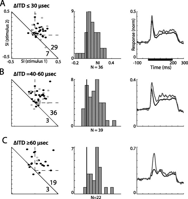
Figure 4.
Summary of ITD oddball tests from all recording sites in the AGFs. A–C, Results are separated to ITD gaps smaller than 30 μs (A), between 40 and 60 μs (B), and larger than 60 μs (C). The left column presents the scatterplots of SI1 versus SI2. Gray points designate recordings from verified single units. The dashed lines mark the first quadrant, where both SIs are positive. The number of points above and below the diagonal line are shown in the bottom right corner. The middle column presents the histograms of the NIs distribution. The black vertical line marks the zero axis (NI, 0). The right column shows the population PSTHs normalized and averaged across all sites. Gray lines designate the population response to the rare stimulus and black lines designate the population response to the common stimulus. The bar in the top plot represents the duration of stimulation.

