
Figure 2.
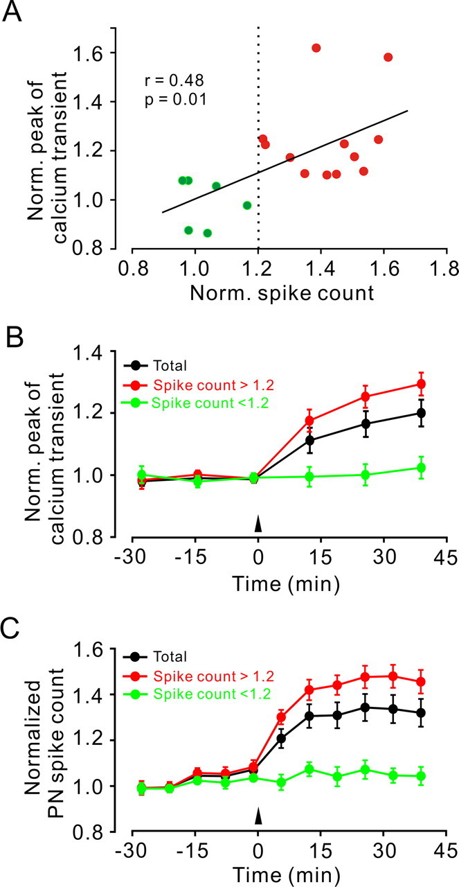
Analysis of 18 experiments conducted as illustrated in Figure 1. A, A plot of the normalized change in peak amplitude of PF Ca2+ transient versus normalized change in PN spike count measured after 4 Hz PF stimulation. Green and red colors along with the dashed line indicate experiments in which the change in spike count was below or above 1.2-fold, respectively. The solid line indicates linear regression (r = 0.48). B, Time course of the change in peak amplitude of PF Ca2+ transient from all experiments (black; n = 18), from experiments in which the spike count change exceeded 1.2-fold (red; n = 12) or was <1.2 (green; n = 6). C, Time course of the change in spike count from the same experiments as in B. Data points in B and C are mean ± SEM. Norm., Normalized.