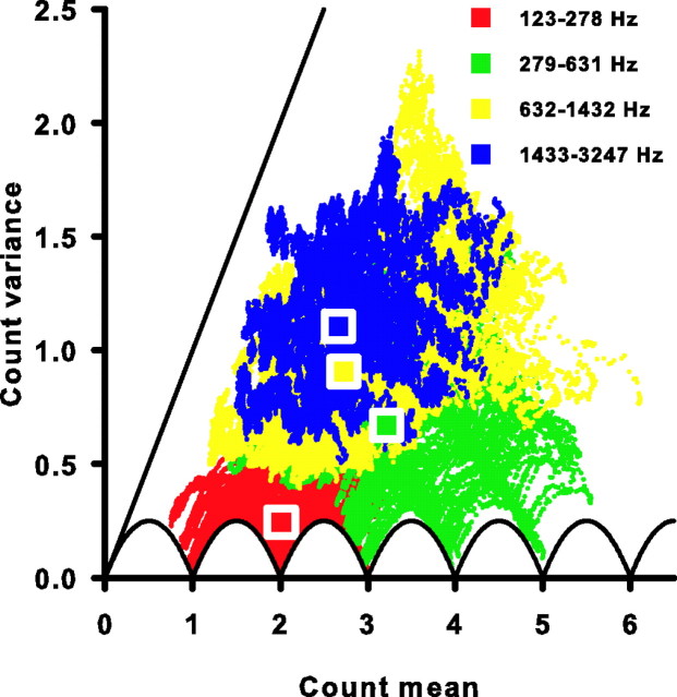
Figure 6.
All cells have sub-Poisson spike-count variance. The spike-count variance is plotted against the spike-count mean for all 10 ms windows of all 85 cells studied (colored symbols). Each color represents a different frequency range (top right key). The solid scalloped line is the minimum variance possible for a given spike-count mean. The solid straight line is the unity line and represents the variance expected for a Poisson process at each mean. Square symbols are plotted at the mean of the count mean and count variance for each frequency range.

