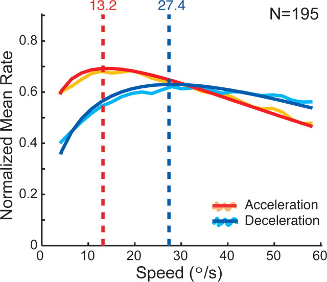
Figure 3.
Mean speed tuning for acceleration versus deceleration speed history (n = 195). Orange and turquoise lines represent the mean of the normalized spike density functions of all neurons for acceleration and deceleration history, respectively. Red and blue lines are the corresponding fits. The vertical dashed lines indicate the preferred speeds of the population responses. The peak of the population response is higher, the preferred speed is lower, and the tuning width is narrower in the acceleration case compared with the deceleration condition (for details, see Results).

