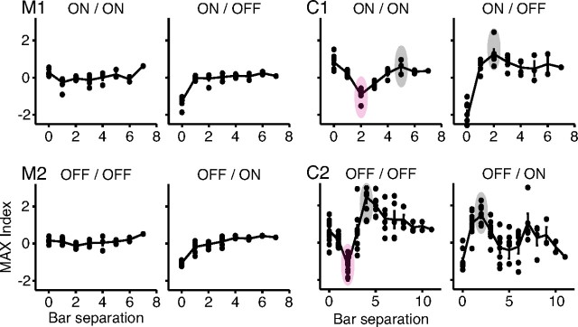
Figure 6.
MAX index plots for the matrices from Figures 3 and 4. The filled circles represent individual MAX indices, whereas the solid line tracks the mean of the indices at each bar separation. Cells M1 and M2 show relatively flat average MAX index profiles that do not vary greatly with bar separation or polarity. Cells C1 and C2 show modulated average MAX index profiles with suppression (MAX indices <0) at small bar separations (purple ovals), and enhancement (MAX indices >0) at larger bar separations (gray ovals) for the same polarity bars. The pattern of suppression reverses when one of the bars switches polarity.

