
Figure 7.
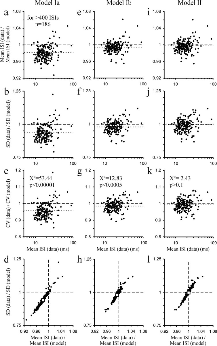
Comparison of the mean ISI, SD, and CV of the 186 samples of spontaneous activity with those predicted by the best fit of the different models. a–l, The left (a–d), center (e–h), and right columns (i–l) show the comparisons for models Ia, Ib, and II, respectively. The top row plots the ratio of the mean ISI in the data to that predicted by each model as a function of ISI; the second and third rows are the corresponding plots for SD and CV. The bottom row plots the ratio of the SDs against that of the means to illustrate their close correlations with slopes >1. The dashed lines mark ratios of 1 (i.e., data and predictions are identical). The dotted lines in the top three rows and the open squares in the bottom row represent the medians obtained from the top 19 of the 186 samples when ranked according to number of ISIs. Note that models Ia and Ib systematically overestimate mean ISI, SD, and CV, whereas model II does not. The results of χ2 tests for CV are listed in the third row.