
Figure 6.
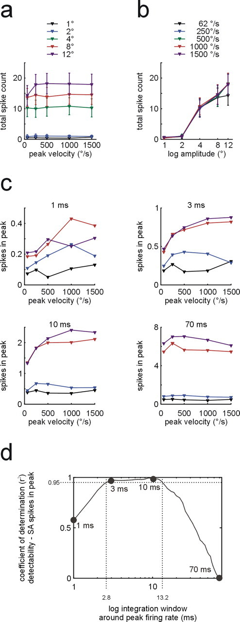
Neurometric plots of SA population responses. a, b, Total spike count within 250 ms after stimulus onset as function of peak velocity (a, curves represent isoamplitude sets; means ±1 SEM) and amplitude (b, curves represent isovelocity sets; both graphs plot means ± SEM). c, Isoamplitude sets (color coded as in a) showing number of spikes in a window around peak firing rate of the transient response as a function of peak velocity. The four panels show results for four different integration window sizes (1, 3, 10, 70 ms). d, Coefficient of determination (variance in detection probability explained by SA spikes counts) as a function of integration window size. Dots indicate the corresponding example plots in c. The dotted lines demarcate the range of window sizes in which >95% of the variance was explained by SA peak spike count.